I was lucky enough to be in Seattle in February, before the global pandemic hit. It was my first time in the Pacific North-West, and perhaps the highlight of the trip was my second week there. From Monday to Thursday, I was able to spend time with the good folks who build Tableau - The Developers.
As an aside, if you’re reading this post and wondering — how can I get in touch with these folks? They don’t bite. I myself decided about 2-3 years ago that I was never going to become a Zen Master, and did want to speak to developers more… So I just did. These folks are awesome, a delight to spend time with and are always fascinated to hear what every single type of user is thinking when it comes to Tableau. You can find a few of them on Twitter, feel free to tag a few folks from the Tableau Twitter community who will point you in the right direction.
Amongst the activities I had planned, I talked about a few things on a regular basis. First was the Profile layer (which I want to write about in another post) and the second was the Tableau Trough.

To explain why this is written on a piece of tissue, we go back to my purpose in Seattle.
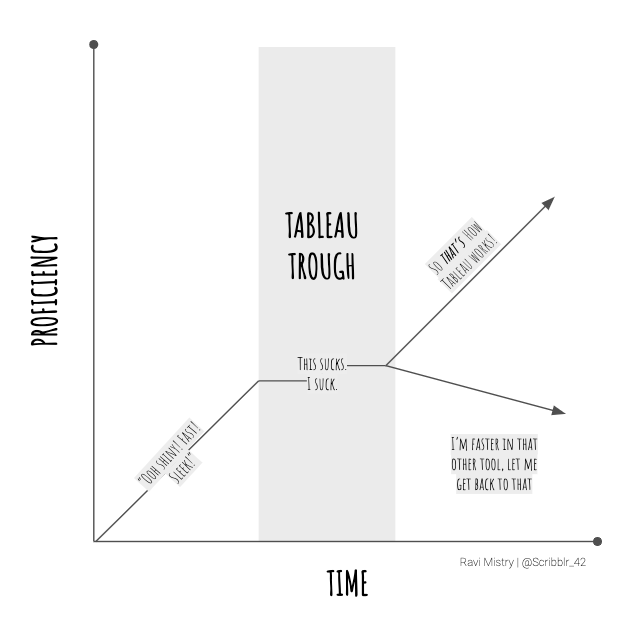
I was there with my (now former) colleague Josh Henderson to represent The Information Lab at the Tableau Sales Kick Off. There, I was chatting to some Devs and ended up talking about my big issue with adoption and learning in Tableau. That, after the first few weeks or months of being blown away by the magic of Tableau, there’s a trough. It’s so much easier to draw sometimes!
I’ve hypothesised a few reasons for this Trough, and a few are around motivation, a few around education and others simply about frustration. So how can Tableau be even better?
Let me break the Trough down.

So above is a more clearer version of what I’m talking about. The first section is simple — it’s the ‘aha’ moment. The moment where everything changes, the user sees a new horizon — something which will help them get from information to insight. They’ve had the demo from the sales rep or consultant, they’ve seen how quick it is, how easy it is. The power of dashboards, the promise of parameters and the oh-so-slick animated transitions. The user can’t wait to get your hands on it, and make those epic dashboards they’ve seen on Tableau Public.
And then you’re hands on! It’s fast! It’s powerful! It’s giving you the answers to your business questions! The Tableau help guide is excellent, the learning paths have been followed, all the training videos watched. The user feels like they have the world at their finger tips. They start building, and it’s all sailing.
One month passes. Maybe two. Even three. The magic has faded a little, and the user is googling in anger. Learning is tough, they’re using Tableau by wrote. Pushing pills using Show Me, following answers on the Tableau forums, tweaking ideas from solutions in the community. But not really understanding — so the user does what most people do. They revert back to what’s easy, what’s simpler and what’s more familiar. Of course, this is sub-optimal behaviour for an organisation who have invested in learning and pushing something forward — but the solution doesn’t work unless there is a clear vision on the application and the direction that this tool is taking you on.
That’s what the Tableau Trough is, the make or break moment where a user has to choose.
Do they want to understand Tableau the software, or they revert back to what’s easy and familiar. This is an interesting inflection point. What can you do? How can this be skipped?
The ‘basic’ answer you may hear is “invest in people” — this is all well and good, and it’s a great initiative. In reality, however, that chart still needs building. That insight still needs delivering. Yes, you can spend time trying to bend your mind around a new tool which has it’s own particular nuances, but there is still “work” to do. So how can an organisation empower their users, whilst also adding value?
I think there is value in contextualised learning in this case — this is where the value of a Tableau specialist comes handy, to act as a translator between the industry specific knowledge and empowering users to understand the tool they have in front of them. Because ultimately this is what the education is — to share, empower and enable people to understand the options and choices they have, before they move forward with their analysis.
Using Tableau in Anger
Another factor to this is using Tableau in anger, which is where the frustration can stem from - but also this is a relevant method of learning. In situations where Tableau is a tool forced or recommended to an individual, it can be annoying to have to unlearn one tool and translate to this new one. So instead of investing time to understand the tool, the user will spend time finding out simply how to get from A to B… Which is sat-nav BI, versus iterative, exploratory BI - Tableau’s sweet spot. Ultimately, this is OK - but the Trough will arrive quicker. The users won’t understand the terms used to search, the user will ultimately get frustrated and revert back to what’s comfortable.
So for a user, they’re still reliant on people. Either a person to invest in their education, learning and development (with the onus on this user to translate this back to their own use case), or reliant on another user or group of users (a centre of excellence, community of practice or external consultancy) to be that educator for them… where there is still an onus on the user to translate their own business knowledge to the application. And I think the application of business knowledge of course must be a part of the process, and isn’t something to be spoon-fed. But that there is some level of support required to attack, consider and conquer the Tableau Trough is absolutely true.
Imagine if Tableau could…
I once heard a story about when Christian Chabot was the CEO of Tableau, he’d wander around the offices, sit in on trainings and what not. And a key phrase he’d mention when he’d drop in began with ‘Imagine if Tableau could…’ and I think this is a perfect Segway as any to fantasise about what could be. I’m going to write a few more blog posts with this as the series ‘title’ as homage to the big man.
I’ve mentioned a few things that an organisation can do, but here’s what I shared with Tableau when I was there on what developers could consider adding to the product to nudge users in the right direction.
So, imagine if Tableau could…
-
Nudge you in the right direction with passive ideas or tricks. I’m not thinking tip of the day, but more ‘worked’ examples of different features within the product.
-
Showed you new features since your previously installed version (ie. “Here’s Set Controls! This is how it could help you, and let’s work through an example together”). I feel in-product tutorials would massively support the usage and understanding. Imagine if you could have a pop-up when you open the Calculated Field window, nudging you to pop open the right hand panel (please make this open by default @Tableau) and see new functions.. Or new buttons in the Dashboard fiew. Even nudges like a ‘new’ star before first use would be neat. Behavioural nudges, innit.
-
Education on understanding how Tableau takes in data sets. Fundamentals such as green things/blue things, dimensions/measures and long/thing vs short/wide are easy to ‘assume’ as tacit knowledge, but small nudges remind users of what happens when things are working through the canvas.
The best examples I can think of built in tutorials are, well, games. In order to learn a new move, or understand game play, the user must complete tasks to see it in action. For example, think about learning to use buttons to do combinations, or the heads-up display nudging the player to do something. There are concepts like this in other areas which can be used by both organisations and developers - thought developers almost certainly are aware of these concepts!
It’s funny — in some ways, you want our old pal Clippy from Microsoft (“I think you’re trying to write a resume! Can I help?”) but in reality the magic comes from the Tableau flavour of this. What if Tableau could have a non-intrusive suggestions engine - I think something like this was demonstrated where suggested Sheets/Dashboards from Tableau Server would pop up.
Ultimately there must be many ways of conquering the Tableau Trough - I just think there must be so many users who get stuck in it, and then start to resent the product… when the reality is that there are just some fundamentals to understanding how Tableau works under the hood.
When should you use a LoD vs a Tableau Calculation? How do Containers work? When do I know how to use a Set vs Group? These are example questions which are ‘easy’ to answer for those of us who live, speak and breathe the product — but for those who work in a silo, haven’t discovered the Community or don’t have the time/bandwidth to learn… it can tricky.
I’d love to hear thoughts on the Trough. Share your thoughts on Twitter, @Scribblr_42 and/or start a thread with your ideas and experiences. I feel there is lots that can be done to solve this problem.