This blog was originally published on The Information Lab: https://www.theinformationlab.co.uk/2018/05/08/consultants-diary-calculated-field-pro-tips/
I’m going to try and share some of the techniques and methods I use as a consultant. Using Tableau & Alteryx daily means that I’ve found I take small techniques, tips & tricks for granted. Hopefully this will be useful for you all.
Using Tableau almost everyday means you pick up a few shortcuts. Here’s some of my favourites when it comes to calculated fields.
Between placements during my time in the Data School, I sat in on some training. Between creating a Pareto whale and supporting DS4, I wrote a quick blog about the 7 ways to create a calculated field in Tableau. Check out this post - and let me know if I’ve missed any - you’ll find some others in the comments on that post.
What I want to share in this particular post is other shortcuts I typically use as I work on a piece of work in Tableau. Let’s get started:
Setting up my calculation window
When you install a fresh new version of Tableau Desktop, you are presented with this fun pop up when you create a calculated field (using one of the ‘traditional’ methods) - but I personally hate this view. I much prefer clicking the little arrow on the right hand side which pops out a menu: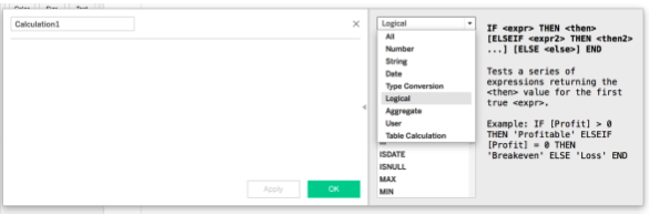
This is for two reasons; the first that you are able to see the explanation of each type of calculation - which I find super useful when both explaining the logic to others, and working out the logic for myself; and second you are able to see the syntax of the function you will use. The fact that each function is organised into sections is also useful, particularly given different functions have different affects on different field types.
Visual Cues
Tableau is full of visual cues - From the small icons for field types, and elements on a measure to indicate different manipulations - I’m thinking the Table Calculation triangle, the Set venn-diagram and the Forecast arrow.
Within the calculated field window, this is no different.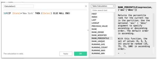
Let’s take the above as an example;
<ul><li>[State] and [Sales] are orange given they are fields within the data source</li><li>‘New York’ is grey given it is a string</li><li>SUM( ) is blue given it is a function</li></ul>Other examples include:
<ul><li>Purple for parameters</li><li>Black or grey for ‘literal’ functions - for example #2018-05-01# returns the ISO formatted date or TRUE/NULL, as well as numeric literals (ie. 1.45 or 12)</li></ul>Documentation Pro-Tips
When documenting calculated fields there are two pro-tips I’d like to share about adding comments.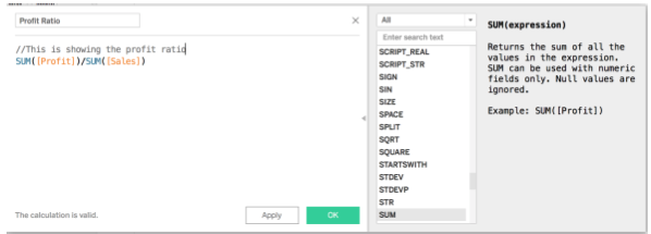
The first one you might perhaps know about - this is where you use two forward slashes (//) to write a comment within the calculated field. This is also useful for troubleshooting whether a long nested calculation is returning what you are looking for - by using // to ‘grey out’ parts of the calculation, and testing what value is being returned by each part.
The second is something I found when preparing for my Tableau Desktop Certification;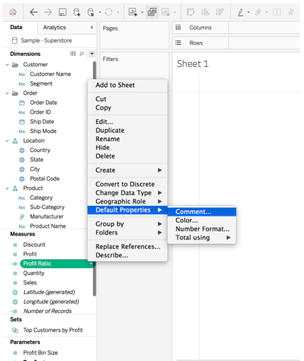
With this function, you’re able to add a comment to your calculated field;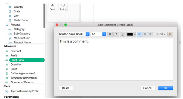
Which looks like this when you hover over the calculation.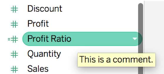
A useful example of this is to either give a quick indication of what the calculation is doing, or what is inside it: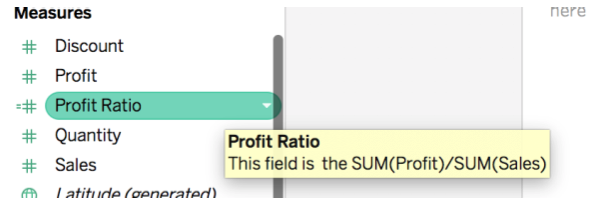
What are your favourite calculation shortcuts?