Zlatan Ibrahimovic was always described as an ‘enigma’ - People weren’t sure how good he really was, he scored often but never really exploded, yet still commanded huge transfer fees - But I think since he moved to Paris St-Germain, he’s really come into his own - A fact which was highlighted when he became the club’s all-time highest goalscorer with 110 goals on the 4th of October 2015.
I made a visualisation to celebrate, using TransferMarkt.com as my data source, scraping the data using Import.io and then adding multiple sheets in Excel. Check out the viz below.
<div class="tableauPlaceholder" style="height: 1469px; width: 804px;">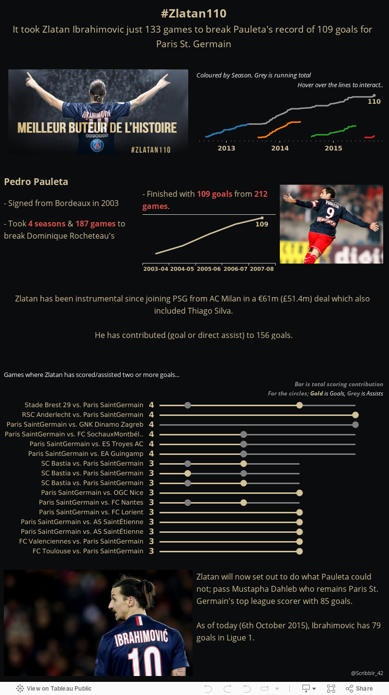 </div>
When I created it, I was quite excitable - it was current, I’d worked hard to get a lot of information on there, and I felt it had a infographic meets visualisation feel to it. Looking at it now, for the purposes of this blog, I think that there’s scope for a makeover.
Let’s talk through it a bit.
I kept a black background in order to utilise the gold text, which enabled me to have a ‘champion’ theme, and I added the image which the PSG Twitter account posted when Zlatan broke the record. Then I added a cumulative goals scored chart, coloured by season with a second overall running total sitting behind - I think this was a mistake, looking back. A simple running total would probably suffice, but I’m still a fan of the information that the tooltips provide.
The comparison to Pauleta was supposed to be a bit of context, but I think it’s a bit distracting, and takes away from the achievement - Particularly as the website I used to get the data doesn’t have the same granularity so therefore doesn’t have the same effect.
Then the ‘radio’ chart. I’m super uncertain about this - I wanted to show the games in which Zlatan has scored or assisted a goal, to show his attacking influence and to show games where he had contributed to at least 3 goals. This needs to change. I think it’s very hard to read, and there definitely is a better way to visualize this particular datapoint.
This was also the first time I had created a scrollable dashboard - one which allows the user to read left to right and scroll to see more - I liked this, but it definitely had it’s issues when actually putting the dashboard together in Tableau.
All in all, on reflection, I think the aethetics, theme and layout of this visualisation was good - I just think that I need to spent a little bit more time thinking through whether something adds value, the underlying narrative of my story & essentially, what the most important points of the visualisation are.
I’ll be doing a makeover of this over the coming weeks I think!